


The new gifting philosophy
Normalize asking for what you want, connect with your friends on a deeper level and remove all the stress from gift giving.

My Roles:
Ux Researcher,
Ux Designer,
Visual Designer
My Team:
Amisha Patel,
Anjali Suri,
Ariana Horn
& Justin Wong
What if showing your appreciation was never stressful or awkward?
Solution:
Guzi is a platform that normalizes asking for what you actually want all while encouraging people to connect beyond material objects and surface-level ideals.
Problem:
There is a disconnect between why we give gifts and what we actually receive. The generous act of giving gifts often brings out feelings of stress and obligation.
Overview:
Using Figma, Miro, Illustrator, and VS Code, my team took three weeks to design a website that performed like a social media and wishlist combined into one. Throughout the course of three weeks we conducted research, created multiple prototypes and started the beginning stages of coding.


click to enlarge
User Research
Since there are existing sites that aid gift giving, it was important for us to get some insight on why using wishlists are not already common place. We conducted 2 polls and 5 interviews, targeting our chosen demographic of people between ages of 20- 30 years old.
—
Pain Points:
People would like to be mindful of other people’s budgets
People fear there will be an unequal exchange of value
Being upfront about what you want is awkward and feels selfish
It is difficult to shop for people who have the means to buy themselves the things they want
Insights:
42% of participants expressed feelings of obligation when it came to gift giving
48% of participants said they would prefer to receive no gift over a bad gift
Only 12% of participants admitted to having gifts as their top love language
User Persona

“If it’s worthwhile, I probably already bought it myself.”
- Max Rodriquez, 24 y.o. Musician
As a Gifter:
Max enjoys showing his appreciation for his loved ones but a lot of his peers are at a point in their lives where they would like to reduce the amount of material possessions. Although he understands this, he still feels social pressure to gift something for birthdays and holidays.
—
As a Recipient:
As a collector and lover of sci-fi, Max will typically be gifted novelty items related to his favorite books and movies. He appreciates the gesture but sometimes novelty gifts end up collecting dust until inevitably getting donated a few months later. However, Max has a collection of every heart-felt letter he’s ever received. He would be happy just being reminded of how his loved ones feel about him.
Definition & Ideation
There are wishlists and platforms already in play that do their job. However, It is not commonplace to put them in practice when buying gifts. We set our main objective to create a safe place for people to be honest about what they want, all while having fun and keeping things casual.
LOW FI - MID FI
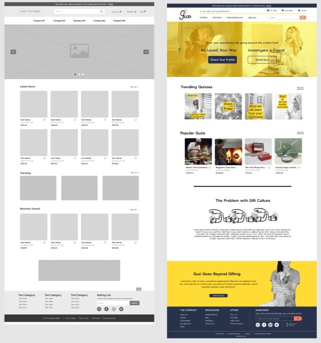
Our Home page was broken up into three sections: Call to action, Content overview, and website philosophy.
User Tests
& Challenges

We conducted multiple user tests for each iteration of our prototypes. Through the screen share feature on Zoom, we are able to track any difficulties in navigation while also observing the users emotional reaction to the prototypes.
Mid Fi User Test Insights:
Although users had an easy time navigating our website, they admitted that they would probably just use Amazon for their wishlist needs. One user explained that the Mid Fi felt generic and like an extra step.
What was missing?
As a team, we knew what we were trying to accomplish. Guzi isn’t just a wishlist, it is a portal where it is okay to be honest and embrace parts of yourself that often get overlooked. However our user tests show that this message wasn’t coming across.
The New Plan
The user test results were difficult to hear but ultimately we appreciated the honest feedback. It was apparent that we focused a little too much on the user interface and not enough on the user experience.

Emphasis on the culture:
We knew we were much more than just another wishlist, but in order for users to be on the same page we needed to make some changes. For our High Fidelity Prototype, we decided to emphasize the profile and quiz features and make our wishlist feature secondary. Prioritizing these features would be showcasing our philosophy and culture over being a glorified shopping list.
Changes to the home page:
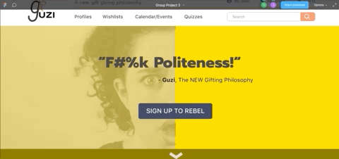
To get our users engaged, we decided to challenge them a little by using some rude language. Even with the rude language, the act of being considerate, inclusive and appreciative is very generous. Our team felt that our demographic could handle a bit of sass, and have more of a reason to share their results and profile with like minded individuals.
click to enlarge
Content:
Our gifting platform, Guzi, will consist of four things: Profile, Wishlists, Calendar and Quizzes. We wanted Guzi to be a platform that can be referenced year round where you can see people’s preferences, track milestones and get to know people beyond their surface level interests .
Creating a safe space:
Having a platform will allow you to express your wants passively so your gifter can set their own perimeters all while removing any of the usual guesswork.
Removing the awkwardness:
Through our unique quizzes you can create a fun dialogue and learn about the things you personally value, and compare it to friends. You’ll be able to curate wishlists that cover different price ranges, suggest experiences that you would be into, and even have the ability to set up a hang out.
click to enlarge
Shareable Content
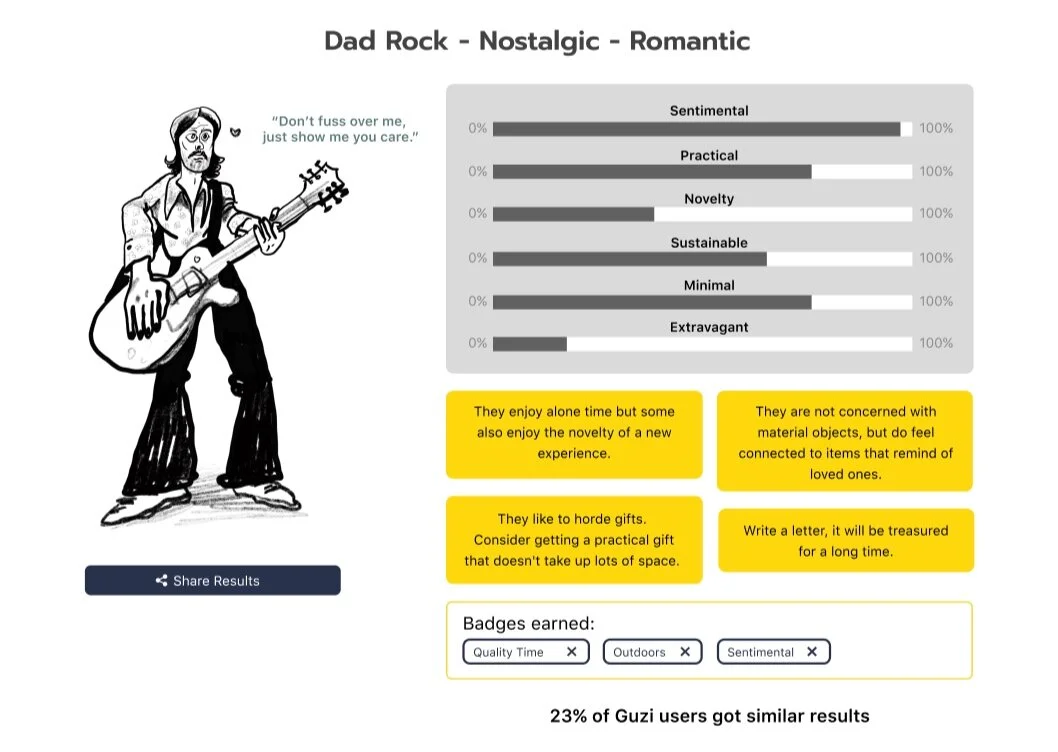
Including shareable content will give an added appeal for the user. When conducting user tests, our demographic loved the concept of taking quizzes and learning more about themselves. A portion of the results will be shareable and can be useful for people who are not yet involved with the website. The unique characters and descriptions might entice users to visit and see what results they get themselves.
MOOD BOARD

Since Guzi is challenging traditional gifting ideals, we decided to go towards a gritty, yet minimal, look with some references to the punk aesthetic. The splashes of yellow keep things playful while also demanding user’s attention. It aligns with our concept of not shying away from expressing your needs. It also makes the experience more casual and interesting, removing the sense of pressure that can often come with gift giving.
Results and
Final Thoughts

Success..?
User’s attention did go up once we went in an edgier direction. We understood that referencing a ‘bad word’ could be polarizing. As expected, Users in the 40+ range did not enjoy the language when surveyed about the home page. However, users who were actually in our demographic (ages 20- 30) did find it amusing. In multiple occasions the shock factor was met with positive feelings, curiosity and laughter.
Next steps
Ultimately, we need to cater to our demographic even if it doesn’t appeal to everyone. Our team would like to develop more of the social aspect. We are still in the process of testing the content. Any thoughts or suggestions? Contact me at damiroleros@gmail.com to give me feedback!
More Case Studies: Moodley | Teensource