

My Role: UX Researcher, UX Designer, UI Designer, Visual Designer
My Team: Hannah Macaulay, Madeleine Patton & Erika Reyes
Let’s Talk About Sex!
Teensource is a nonprofit website that provides unbiased sexual and reproductive education for teens. My team and I felt very inspired by Teensource’s mission to provide relevant and inclusive information. We saw the opportunity to reimagine how their information is presented.
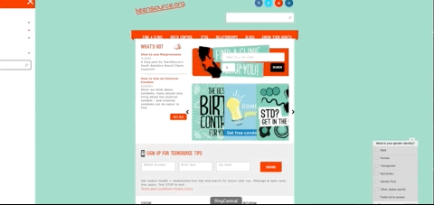
Before:
The original Teensource website feels a little outdated. The content is amazing and we loved the sense of community on this platform. However, we felt that the text-heavy pages and lack of visual interest could be deterring an audience that could benefit from this information.
Heuristic Evaluation
Some roadblocks we also encountered included some issues with usability. We interviewed 5 people and assigned them three tasks to complete on the website. 5 out of 5 users could not find information about birth control affordability. This informed us that there could be improvements within the card sorting.

User Research
In order to effectively design a great resource, it was important for us to do some research about the general public’s relationship with sex education. Although we are leaving the content portion up to Teensource to provide, getting a well rounded view of what role this website could potentially play made it easier for our team to prioritize the information.
Insight:
Despite 95.5% of surveyed people having sexual education in their high school curriculum, 100% of them reported supplementing their programs with outside resources such as google, porn, and peers. This is problematic because this information can be inaccurate, incomplete, and in some cases, dangerous.
Design &
What Teens care about
Relating to teens:
We understand that our demographic is web savvy. In a way, Teensource has to compete against other online content such as social media and other sources of entertainment. We decided that capturing a youthful visual language was essential.
Mood Board
Today’s teen is bold , unapologetic, progressive, and unafraid to challenge traditions. When creating a mood board we looked for photos that reflected those exact things. We included some graphics from the 1960s that also shared the same sort of counterculture attitude and social consciousness that is also prevalent today.
click to enlarge

Information Architecture
Simplifying navigation:
We came together as a group and reorganized the navigation through a card sorting. We decided to condense the primary navigation (the top bar) into 3 categories. We wanted to make the search bar stand out and we also wanted to add a “safe exit” option in thinking of those users who don’t feel as comfortable or safe being seen looking at this website.
Before
click to enlarge
After
click to enlarge
Final Redesign
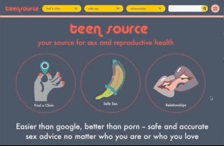
Desktop Design:
The cheeky redesign was a hit. User’s appreciated the frankness of the language and imagery. With our redesign, the time it took to preform our user tasks were cut down significantly. A smooth experience makes this redesign a successful resource and gives the content the visibility it deserves.
click to enlarge
Mobile Design:
Making the mobile version function seamlessly was essential. Even users outside our demographic where interested in the content.
click to enlarge
Final Thoughts
Next steps:
In the future we would like to include some more interactive elements. We would also like to add a portion where people can reference a FAQ answered by doctors.
What do you think? Is this a resource you think teens would find valuable? Let me know your feed back at damiroleros@gmail.com